

How to retweet tweets from specific user with python, tutorial
How to retweet all tweets from a specific user, not a search query? This was my challenge for today and find a simple solution that can retweet all tweets.


How to save all you Twitter flowers ?
In this tutorial, I will show you how to extract all your followers to CSV/excel using a simple python script. Together with followers screen name, you will also get their description number of followers, language, and location. This can help you monitor your account and see how you progress with your followers.

This tutorial is based on Tweepy library and python v3.6

Twitter bot in python - How to retweet from multiple #hashtags
A Twitterbot is a code that integrates with the Twitter API platform. You can automatically post, retweeting, like, or following other users. Just remember no Spamming, Twitter set daily limits also on API calls for free users so don't be too aggressive with your programme.
This tutorial will walk you through how to create twitter bot that will find a specific hashtag, retweet the tweets.

This tutorial will walk you through how to create twitter bot that will find a specific hashtag, retweet the tweets.

Arduino temperature and humidity station with DHT11 and 1602 LCD + I2C shield
DHT11 humidity and temperature sensor is perfect for your electronics projects. i.e. weather stations, home environment control systems, and agricultural/garden monitoring systems.

UN Social 500 - Thank you all readers !
@piotrkrosniak Well done! You are ranked #471 on the inaugural UN Social 500 #UNSocial500. http://t.co/vVCR0dL8Lu #UNInflux
— UN Social 500 (@unsocial500) March 17, 2015
Font Awesome icons for Power Point

Google fusion table and data visualization - Google Maps and Fusion Table Swipe Effect
The Google Maps swipe layer tool is used to interactively reveal layers beneath the layer being swiped. This tool makes it easy to see what is underneath a particular layer and compare data from two data-sets. To use the Swipe Layer tool, you need to create map in your Fusion Table and copy Table ID to code snippet from GitHub.

Google fusion table and data visualization - New Google Chart API and Fusion Table Info Window - Tutorial !
New Google Chart API it's great tool to work with Fusion Table and Google Maps, together in your hand it's will take yours works to the next level ! In this tutorial I will show You how to create cool map with charts based on data from Google Fusion Table. Remember Google Chart API is so simple yet so powerful that can give you some amazing features:
DEMO on GitHub

DEMO on GitHub
- Rich Gallery - Choose from a variety of charts. From simple scatter plots to hierarchical treemaps, find the best fit for your data.
- Customizable - Make the charts your own. Configure an extensive set of options to perfectly match the look and feel of your website.
- HTML5 / SVG - Cross-browser compatibility (adopting VML for older IE versions) and cross-platform portability to iOS and new Android releases. No plugins are needed.
- Free - Use the same chart tools Google uses, completely free and with three years' backward compatability guaranteed.
- Controls and Dashboards New! - Easily connect charts and controls into an interactive dashboard.
- Dynamic Data - Connect to your data in real time using a variety of data connection tools and protocol.
Google fusion table and data visualization - Info Window with tabs for Fusion Table
TabInfoWindow4FusionTable is a simple script for using a JQuery UI Tabs to display data from Fusion table on the Map. Tabs are easy to implement and can be built to work with your existing markup. Creating tabbed interfaces becomes a piece-of-cake when using the Tabs function in the jQuery UI library. It can be utilized to create completely unique interfaces without having to be a coding expert.

This guide will walk through the process of adding JQuery tabs to your map.
DEMO is available on GitHub
This guide will walk through the process of adding JQuery tabs to your map.
DEMO is available on GitHub
Google fusion table and data visualization - jQuery layers slider - tutorial
 This Tutorial will show you how to customize FuisonTableSlider to your data set and create a data visualization project with it. It will walk you through adding the fusion table layers to Google Maps API (v3) and creating your first visualization web application.
DEMO on GitHub
Google fusion table and data visualization - JQuery simple slider and Google FusionTableLayer - tutorial

Google fusion table and data visualization - How to insert a chart into Google Map InfoWindow
Fusion Table Info window provide you with a space to put text or HTML code you like. What is important you can choose the content of your info window based on the data in Fusion Table columns. This is starting to be fun when you include Google Charts and create interactive dynamic charts for the readers.
 1. Once data has been cleaned and uploaded to Google Fusion Tables and Map view created. How you can do this was described in previous tutorials. We can start changing our InfoWindow.
2. First we need to click on Change InfoWindow layout in left column and then switch from Automatic to Custom tab.

2. First we need to click on Change InfoWindow layout in left column and then switch from Automatic to Custom tab.
Google fusion table and data visualization - How to create thematic polygon data map tutorial
This is my second tutorial about Google Fusion tables, this time I will show you how to create thematic polygon data map with Fusion Table.

1. Go to Fusion Table and click Open. You can add data from Computer, Google Spreadsheet or just paste the link with data from Internet. That's really cool!

1. Go to Fusion Table and click Open. You can add data from Computer, Google Spreadsheet or just paste the link with data from Internet. That's really cool!
Converting external RSS Feed to GeoRSS - tutorial
GeoRSS is an emerging standard for encoding location as part of a RSS feed. For me the most interesting how it's can be utilize in humanitarian projects and natural disaster alert systems.
Some time ago UN humanitarian aid agencies began cooperation on construction of a common alert and coordination system for natural disasters, GDACS. Information from several separate organizations are gathered, processed and republished. Echange of data is based on GeoRSS.

Let's try to build Georss from external RSS Feed and publish this as a layer on the map using Google Maps.
TIP: You can find many Georss Feeds in Internet and add them as a layer to the map. Here is a one of the repository of natural hazards feeds.
1. We need to convert our RSS feed to GeoRSS Feed. The best way is to use special converter from Geonames.org
Google fusion table and data visualization - how to create cool heatmap with your data, tutorial
Google Fusion Tables is a very good modern data management web application.This is a new application from Google and still in the experimental
phase. Fusion Table could be integrated with other Google tools, e.g. Google
Doc, Forms, Spreadsheet, etc. and added to Google Drive and data can be
imported from those tools or online into Fusion Table.

Let's try this new tool and create simple Heatmap with our data. Heatmaps display colors on the map to represent the density of points from a table.
TIP: Google Fusion Table can be accessed under Google Drive. But first you need to add this option to your Google Drive.

Let's try this new tool and create simple Heatmap with our data. Heatmaps display colors on the map to represent the density of points from a table.
TIP: Google Fusion Table can be accessed under Google Drive. But first you need to add this option to your Google Drive.
Before after jQuery image effect for Blogger - floods in Philippines Landsat images
Some time ago I was searching for information about post disaster situation in Philippines after Typhoon Haiyan (Yolanda) and I found a satellite pictures showed a City of Tacloban just after Typhoon. To
show magnitute of the disaster, they showed a before
and after picture using Flash that let the visitor drag a slider over
the images, so that
you could easily see how dramatic the changes were. I immediately
thought that this could be nice tool for humanitarian action teams to present situations and also changes after reconstruction process/projects.
Data visualization with CartoDB - Tutorial how to merge two tables - choropleth map
CartoDB it's in my opinion one of the best online maping platform. Functionality is perfect for data visualization it's has done a great job of making the simple tasks
even easier to do. Uploading data to create an embeddable map is fairly
straight forward and takes just a few minutes.

If you need to visualize data for every country and your data in a spreadsheet like Excel, CSV, you can easily merge it with other tables with geo-coordinateness and crate beautiful maps ! Just follow this steps.
TIP: When you merge two tables one with details coordinates and second only with Country Names or ISO Codes, then you don't need to proceed geocoding.
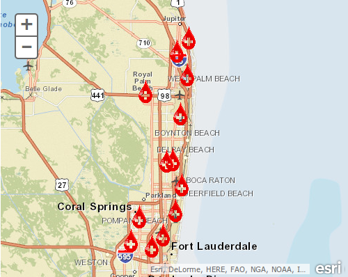
How to add custom symbols in ArcGIS Online - 8 step tutorial
ArcGIS Online provides quick and simple mapping with basic GIS
functionality for free. This is great tool to start your journey with maping. Maps can be created and viewed on-line via
ArcGIS.com and share with friends or coworkers. Maps can be also embed to any website, blog etc.
Throughout this tutorial, we’ll walk you through the creation of a basic custom symbols for our map. It’ll consist of two parts: Creation of simple map and adding a layer to the map and second adding our symbols and publishing map.

TIP: Symbols (Symbology) is one the most important component of good mapping. You can read more about this in GIS WIKI
1. First you need to login to Arcgis.com, you will need an ESRI Global Account to save and share maps, don't worry it's free.
2. Click on the Map button in top Menu to create a new map (all your saved maps can accessed from the My Content tab).
Throughout this tutorial, we’ll walk you through the creation of a basic custom symbols for our map. It’ll consist of two parts: Creation of simple map and adding a layer to the map and second adding our symbols and publishing map.
TIP: Symbols (Symbology) is one the most important component of good mapping. You can read more about this in GIS WIKI
1. First you need to login to Arcgis.com, you will need an ESRI Global Account to save and share maps, don't worry it's free.
2. Click on the Map button in top Menu to create a new map (all your saved maps can accessed from the My Content tab).
Subscribe to:
Posts (Atom)
